
Mar.
3
Holland Park
 Guest Contributor KATRINA PHILLIPS is the owner of a full-service interior design firm and retail shop in London, England.
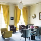
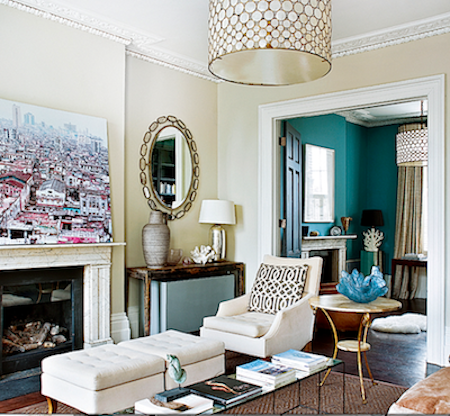
LONDON — This room was entirely restored, retaining the original proportions and cornices. We chose a calm stone colour from Papers and Paints in Fulham. Although the room is tall and light, I wanted to enhance the dull British skies with gentle lighting and mirrors, so we created bespoke lamps from glass vases and large olive oil pots. As the room is tonal in nature, very calming, with a classical contemporary feel, we made use of texture to create visual and tactile interest: polished silver surfaces next to stoneware, antique wood, mother of pearl, crunchy crystal, soft velvety and thick linens, aged mirror and dull gold.
The key piece in the room is the antique Syrian chest in wood, mother of pearl and marble which my clients had already. The chest works well with my aesthetic, as I purchase antique pieces from Syria for my shop (and continue to do so even during the civil war: it helps to support the family I work with there. It’s amazing to me that even during a terrible war, I can arrange to purchase an antique Syrian mirror and it arrives intact). The oval mirrors are from my shop, as well as the crystals. The ivory chairs came from the clients former home in America and much of their design aesthetic is based more on New York/East Coast style than London. It’s a style I’m really comfortable with, as I studied and lived on the East Coast for several years. So I suppose this design style is transatlantic modern?
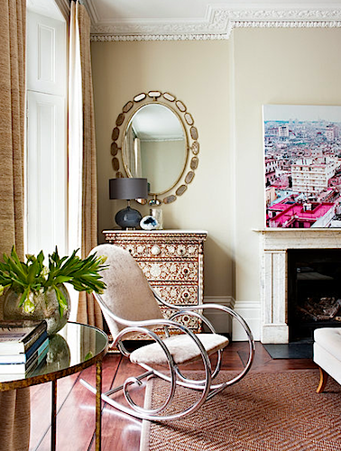 I met my client in my shop when she came in to buy this mid-century rocking chair. I bought the chair in Paris: it’s based upon a Thonet design and I had it polished and reupholstered in a Paulo Moschino velvet. My client loved the combination of the soft silver with the silky taupe velvet, and in a way, this chair became the design scheme for much of the house. So it’s a lucky chair for me.
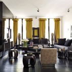
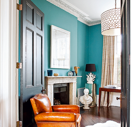 The view through the main drawing room into the study, painted in a deep turquoise, almost teal. The original partition doors were restored and painted near black. The beautiful blue glass bowl full of movement is from Vessel Gallery in London. The trellis-style fabric on the chair cushion is by American designer, Kelly Wearstler.
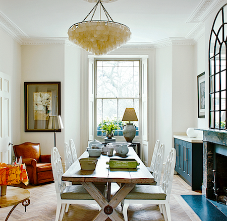 A palette of charcoal, white and stone allows the guests, the family, and the meal to become the focal point of the dining room. The display on the dining table, which also serves as a large desk for the children and their painting, and homework, changes according to the season. The dining table was made by us from reclaimed oak and we have our own secret pickling recipe to bleach the wood. I love unfinished works, saving fragments, giving them a new life..they are like little notes from the past, love letters from history. I also love working with old architectural designs with scribbles on them before the computer age. The dining chairs are from New York, the leather club chair is a very British classic!
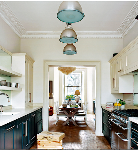 This is a highly functional galley kitchen, so carefully designed that you hardly know its there. In London, this large family has to be highly organised and keep things simple, and this kitchen reflects that. It’s discreet and perfect, the palette is like a black and white photograph.
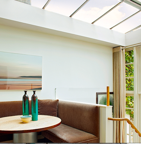 We made use of a corner to create a banquette area for children’s suppers. The banquette is upholstered in beautiful Chase Erwin mink mohair velvet: elegant yet resilient, like the house and it’s occupiers.
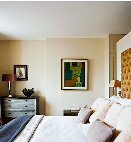 The master bedroom is petite and has artworks that are of intimate meaning to the clients. We made use of the tones within the artworks. I chose to work with a warm ochre in the paintings: the headboard, deep buttoned, was made by my workshop, in a slubby Chase Erwin ochre fabric, it gives a warm glow to the room. I really do think it’s important to work with a client’s art, there’s nothing worse than an artwork which “fights” a room. So many people don’t consider the colours of their art when thinking about a room, or they’ll plonk a piece of art in afterwards as a statement. When visiting artists in their own homes, I noticed that they literally surround themselves in their palette. When creating a scheme, if a client has a piece of art that they love, I will study the painting and choose two or three colours from the artwork to create the scheme for that room. This Holland Park home was created entirely around the client’s art collection and the needs of the family.
For more information, please visit Katrina Phillips Interiors online.


| • Design | • Comments Off on Holland Park |